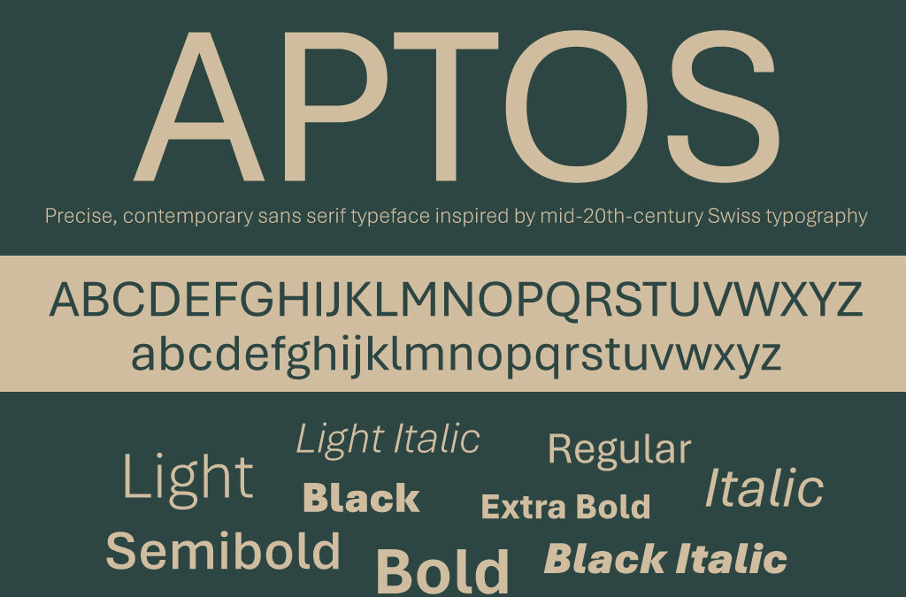
Following a lengthy period of 15 years, Microsoft recently opted to update the default font used in its Office applications, switching from Calibri to Aptos. This significant alteration was publicly announced in July of 2023, with the implementation being gradually introduced to users in stages, many users now just notice that their default font has changed.
In the dynamic world of technology and design, the introduction of a new font can sometimes go unnoticed by the public. However, for those in the know, it’s a significant event that can influence trends, branding, and user experience. Microsoft’s recent adoption of the Aptos font marks such an occasion, reflecting its continuous effort to refine and enhance its visual identity and usability across its vast array of products and services.
The Aptos Font: A Blend of Functionality and Style
The Aptos font is not just another addition to the font library; it’s a meticulously designed typeface that embodies modernity, readability, and versatility. Its design strikes a balance between aesthetic appeal and practical functionality, making it suitable for a wide range of applications, from user interfaces to marketing materials.
One of the defining characteristics of the Aptos font is its legibility. In an era where digital content consumption is at an all-time high, text clarity is paramount. Aptos has been crafted with attention to detail, ensuring that each letterform is distinct and easy to read, even at smaller sizes. This feature is particularly beneficial for users with visual impairments or those who spend long hours in front of screens, reducing eye strain and improving overall accessibility.
The style of the Aptos font is modern yet timeless. It boasts clean lines and a streamlined appearance, which aligns perfectly with Microsoft’s branding philosophy.
Enhancing User Experience Across Microsoft’s Ecosystem
Microsoft’s decision to use the Aptos font is not merely a cosmetic update; it’s a strategic move aimed at enhancing the user experience across its ecosystem. From Windows operating systems to Office applications and beyond, the uniformity of the font contributes to a cohesive and harmonious user interface.

